I find these pictures way more interesting when they are actual photos. Now that I’ve checked a few out, and discovered how many are illustrations–like this one–I’m way less impressed.
Clicking on the image to get the explanation is still sometimes interesting, but it seems perverse to link the (phony) image when it’s the text that’s the interesting part.
The text would be easier to quote and easier on our web connections.
They’re making them up again. That means they photographed something they don’t want us to see… ![]()
In these parts, we generally call 'em “artist’s impression” or “simulation”. ![]()
As the whole point of this type of image is that a photograph (at least one of any use as a meaningful illustration) is not available, and as the article is most definitely of interest, I don’t mind the bogus pic at all. Obviously real photos are preferable, but we takes what we can get.
Anyway, what level of phoniness is acceptable? Many astronimical images are rendered in false colour, but still termed “photographs”. ![]()
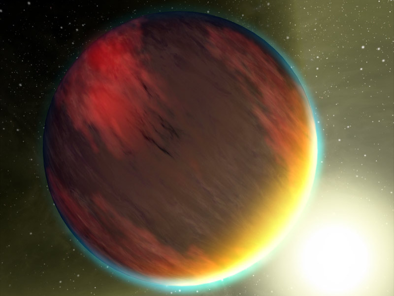
Good link, Denny. Shame about the lack of water vapour - less likely to have new neighbours in that neck of the woods. ![]()
And Jupiter-sized planets in Mercury-like orbits? Yipe… ![]()
“astronimical”? Wow, I invented a word.
It means a combination of Marmite and Guinness…
I think you mean assnomical ![]()
I think you may be right…
One of those planets turned out to have atmospheric components made of silica. How weird it that, and who could have predicted it? I’m not too keen on the “artist’s impressions” but the stories behind them are always food for thought (such as mine are ![]() ).
).
djm
Anyone else want to see the actual equations and spectrascopic data?
Okay. Sure. Why not. Might make an interesting wallpaper. ![]()
livin’ on the edge…
As opposed to a picture of nothing?
s1m0n…you are like, sooo grumpy
I think there were silica creatures on one of the Star Trek episodes…big ol’ rockpile folken.
Stoners.
Those were the Horta. They were truly hard rockers. ![]()
djm
Any species that can get first aid from quick drying concrete must be tough… ![]()
By the way… GEEEEEEEK! ![]()
“Dammit, Jim, I’m a doctor, not a bricklayer!”
![]()